Declaro

Trips in the Cloud

Overview

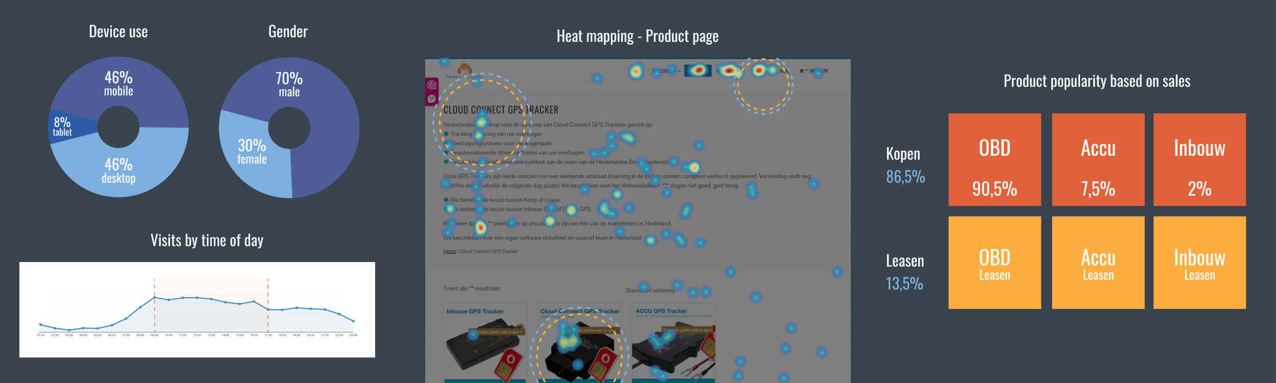
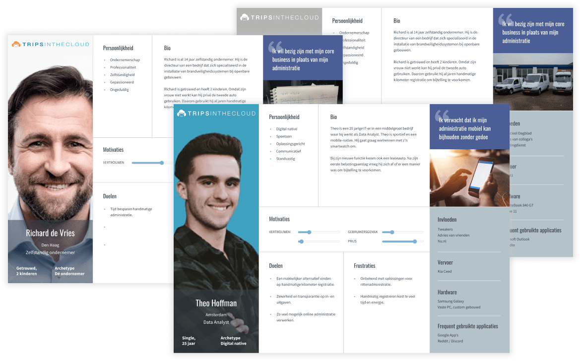
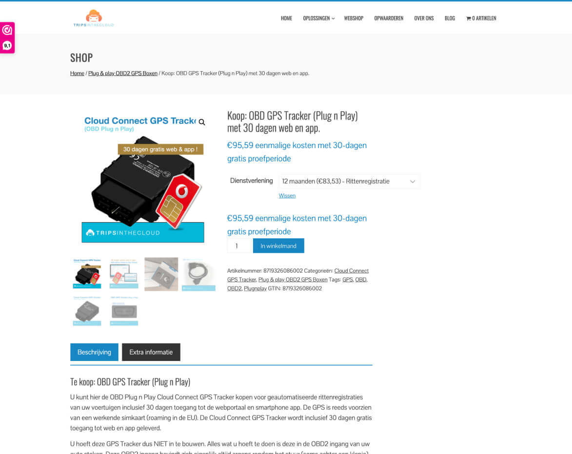
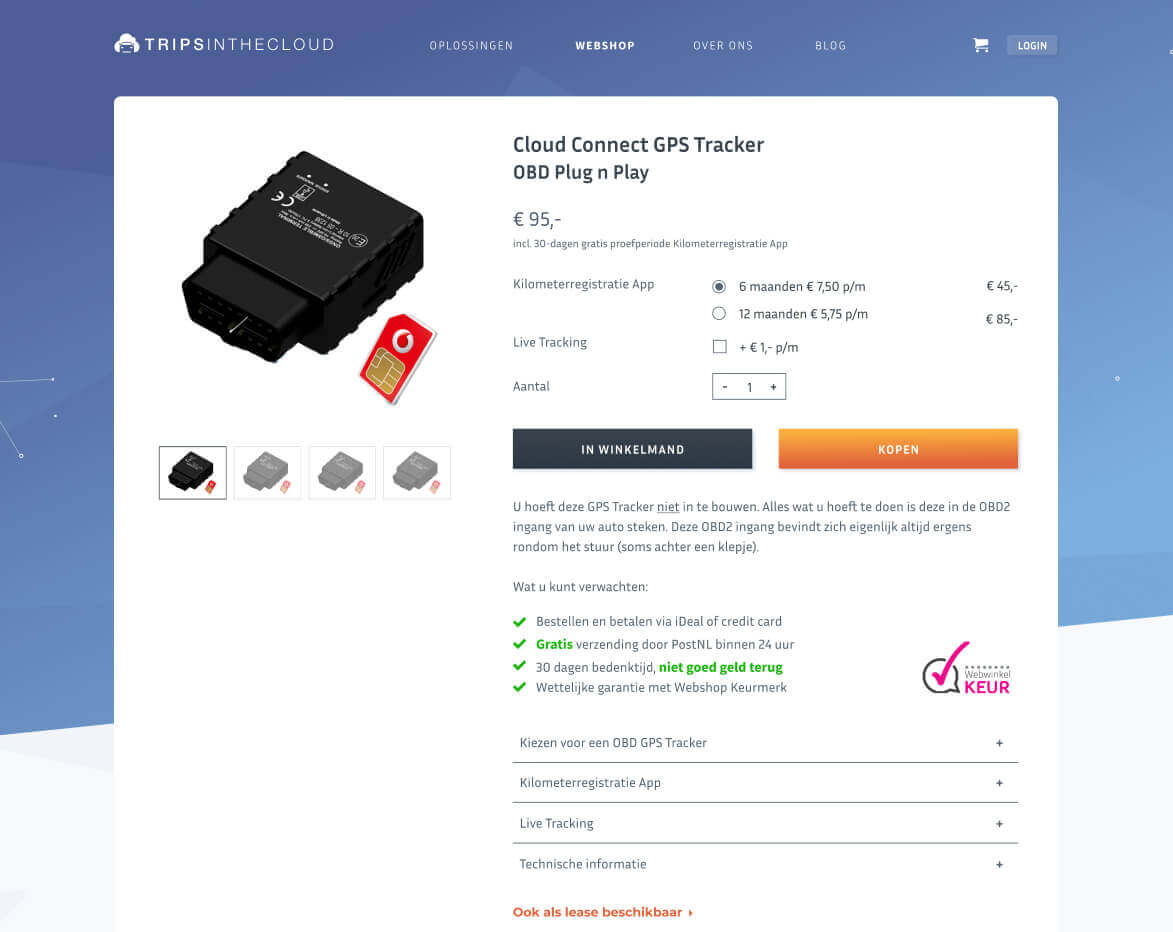
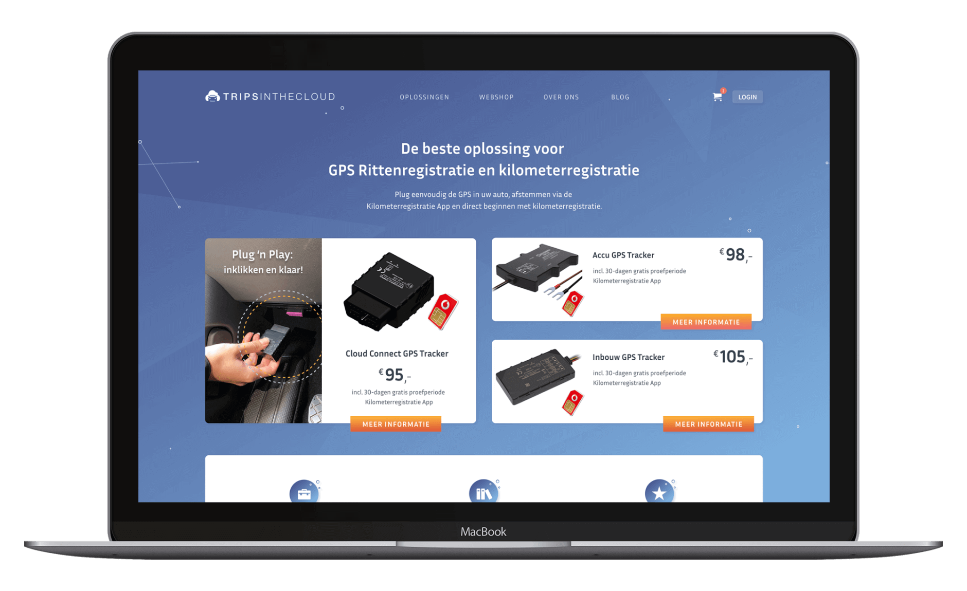
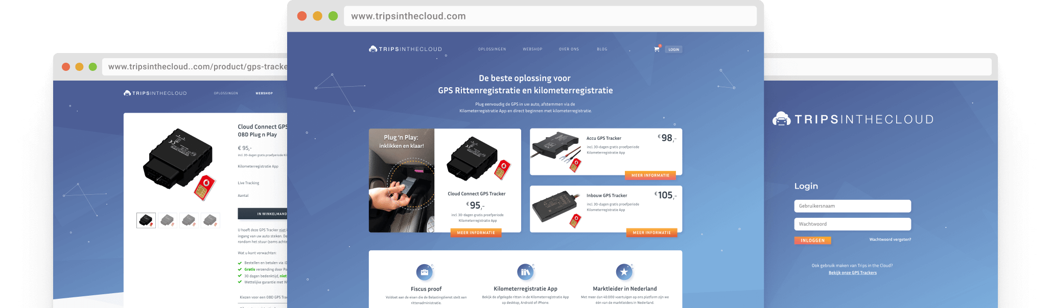
Trips in the Clouds is a webshop selling GPS tracker hard- and software. Since their initial launch 6 years ago, very little UX improvements had been made.

The goal of the project was to improve the design of the webshop, making it easier for users to find product information and make a purchase.

View project

Role

UX Designer &
WordPress developer

UX Research, UI Design, Prototyping & Testing, Wordpress implementation

Dec. 2020 - March 2021

Background

Trips in the Cloud’s website had become a bit of a “Frankenstein”. Outdated information, a lack of cohesive design elements, a lack of element hierarchy, a complex taxonomy and a clouded user flow were all contributing to major usability issues.

As the sole designer responsible for this project, I both led it and corresponded with the owner while building out the designs. I conducted multiple rounds of research. I produced sketches, wireframes, and mockups. I delivered final assets and documents, did front-end development, verified the live product, and iterated again for multiple rounds.


The original 2016 website

UX Research

Because Trips in the Cloud had already been operating for 6 years, I was able to perform a historical data analysis on the existing site. In order to understand how users were engaging with specific elements of the current website, I initiated regular heat mapping. This information was paired with data collected from ongoing user testing. User behavior immediately indicated that there were major experience issues to be found throughout the site and its product funnel, thus beginning an iterative redesign to the site itself.

Gathering inspiration

Now that I had background data on the site, I began canvassing the industry, as well as constructing a list of direct competitors. The ultimate goal was to scope out the GPS tracking and software market, get inspired, and find opportunities for innovation on our part.

Competitive analysis

I performed a light competitive analysis and used it to gauge which elements our competition was prioritizing in comparison to us. It turned out that we actually had a lot of the core features our competition had. However, there was still a massive opportunity to be had in the design and development of those items and functionalities.

Trips in the Cloud UX Research

Defining personas

Based on our research and interviews with the owner, we identified three main types of users. During a team workshop we developed these into personas that would be used for customer journey mapping as well as marketing campaign focus testing.


Trips in the Cloud personas

Design System

After completing the wireframing I started work on building a mood board and design elements that would later form into the design system. I created a simple version (shown below) that would serve as the brand guidelines as well as a full design system for the application developers.


Trips in the Cloud design system

Product page design

An important feature of the redesign was the product page. The old product page did not explain the subscription model and extra options sufficiently, thus making the experience for the customer poor. The heatmap results showed users were unable to make an educated choice for the subscription and left the page without putting it in the shopping basket.

With the redesign I added hierarchy to the page, creating a flow of information for the user to follow. I also added an emphasis on the USP's so a sense of trust could be built.

Conclusion

TThe new Trips in the Cloud website is modern and provides a clear structure of information with transparent product details. This has led to a decrease in visitor bounce rates of 30%. Heatmaps also indicate users are able to find relevant information much faster.

Some key takeaways from this project are:

  • Design for a team. Setting up documentation and a clear design systems means that hand-overs are smooth, giving developers the tools they need to start implementation.
  • Focus on the problem. At the end of the day, it is your users' pains that you will be solving, so keeping that front of mind is important. It is easy to lose sight of this when you're bogged down in the details.
  • Don't worry too much about the details. Earlier in the project I made the mistake of worrying about the look of the UI. Taking a step back and reassessing the user flows helped me to reprioritise the UX.
Final design Trips in the Cloud