Declaro

Declaro

Overview

Declaro was a start-up in need of a brand identity and website to promote their B2B mileage registration software.

The goal of the project was to create an attractive brand identity that could be used across platforms to promote the product.

View project

Role

UX Designer

Brand Workshops, Brand design, Visual design, Prototyping & Testing, Wordpress implementation

Nov. 2020 - Jan. 2021

Background

With a growing demand to easily manage the mileage registration of your employees, Declaro stepped in with their new product that lets companies easily manage their company cars.

I was the sole designer of the founding team.

I was taken on as designer in the small team consisting of the founder, project manager and a small team of app developers. I led the brand development, marketing, UX research and WordPress theme development for the team. Some of the key contributions for this project include:

  • Hosting brand workshops. To figure out the desired strategy for the company I hosted several brand workshops, focussing on customer identification, customer journey mapping and persona creation.
  • Creating a brand identity. I set to work sketching logo ideas, creating color schemes and setting up a cohesive identity guideline. The style guide and design system were set up in Figma so the entire team could access it.
  • Rebranding the existing application. I assisted the developers in applying the new brand guide to the application.
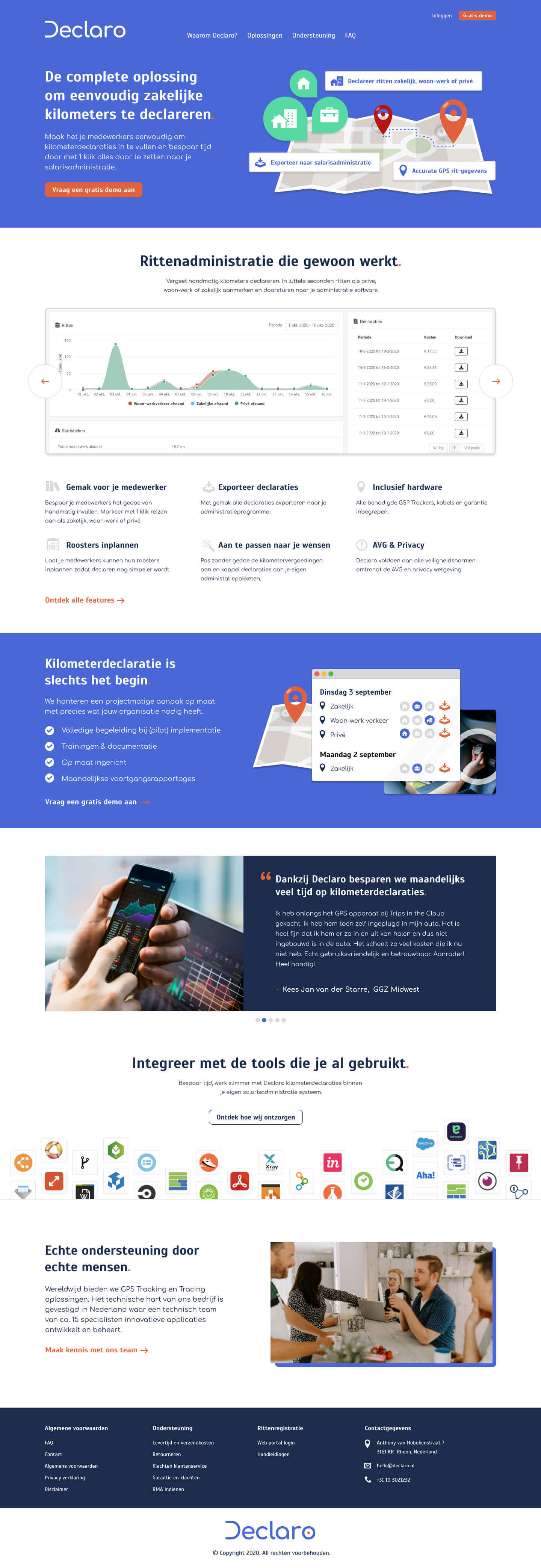
  • Creation of marketing website. I designed the marketing website with the goal to attract potential customers for a free demo. I implemented this design in WordPress so it can easily be managed.

Visual design

After the brand workshops and sketching phase, I used Adobe Illustrator and Figma to create a logo, brand guide and design system to support the brand identity.


Declaro design system

UX designs

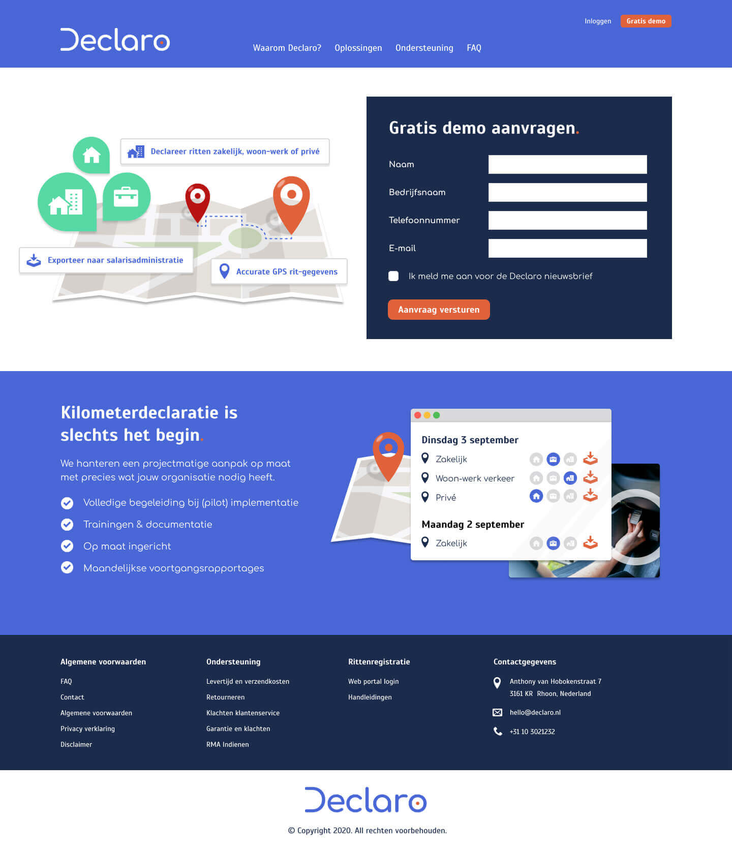
I focused next on creating a marketing website with the main goal of getting potential customers interested in trying out a free demo. After wireframing different options and testing them internally, we settled on an easy to maintain design that I implemented in WordPress.


Frontpage

Declaro screens

Request demo

Declaro screens

FAQ

Declaro screens

Results and takeaways

Within the timespan of a few months we established Declaro as a strong brand in its market. We have received positive feedback from users saying the application and website were clean and easy to use.

The team will continue to iterate on the current design of the marketing website and application. Further expansions of the brand based on the design system are also planned, such as reskinning the mobile applications and starting a print campaign.

Some key takeaways from this project are:

  • With an agile team you can go fast. We worked in quick sprints to achieve fast results with rapid delivery times. Project management was essential, as knots in communication would result in being unable to make the delivery date.
  • Involve the team for the best brainstorm sessions. The founder and project manager both had long years of experience in the field. By involving them early and hosting brand workshops we were able to distill the essence of the brand identity.
  • Focus on continued optimization. By adding utilization of tools like Google Analytics and HotJar, we were able to create a culture of ongoing iteration, where live data and user feedback would continue to shape the product.